
Showing posts with label Cosmetics Unit. Show all posts
Showing posts with label Cosmetics Unit. Show all posts
Tuesday, 30 November 2010

Friday, 5 November 2010
My Final Adverts and Analysis/Evaluation


Analysis and Evaluation of Cosmetics Advertisement
Construction
In my advertisement i have used a medium shot of Catherine(Model), i wanted a shot that captured the details of her from her chest up but also capture the surroundings to show where she is and even establish what she is doing. I wanted her to the right in the photo so then behind her the light shone through the trees leading the eye towards her and the perfume bottle using the rule of thirds. The focus is mainly on Catherine but its not so focused that the background becomes blurry or fuzzy because i wanted the surroundings to be seen as well as her.
I have used natural lighting in my advert, the light shining through the trees onto Catherine and the forest connote natural beauty at it's finest. Untouched beauty if you will, which gives you a feel of hope. It also connotes an angelic feel, as if Catherine is mother nature or an angel.
The mise en scene is the forest, all i wanted was what looked like an untouched piece of woodland with a break of light through the trees and a large tree for Catherine to hide behind. The forest connotes a natural sense of beauty just as the light does, but it to a greater degree. The woodland connotes beauty and peace as well as a calm and gentle feel. It makes the target audience feel calm yet excited about the perfume because it natural beauty and is telling them that there is no need to be fake, just be natural.
I didn't crop my image because i took it just how i wanted it to be.
The name of the perfume is Hush and the tag line is 'Smell as gorgeous,gracious and delicious as fresh forest air'. The name of the advertisement connotes quietness and calmness, it adds to the connotations of nature because it says that you should be quiet and smell the freshness of nature and its beauty. The tag line adds to the meanings into the advertisement by basically saying what this perfume will make you as gorgeous as a lush woodland.
The narrative of the advertisement originally was that she was being chased by men because she smelt so good,but i changed it because i thought the idea of her wanting everything to be quiet so she can listen,smell and see the magneficence of the woodland seemed more realistic and beliveable, it also seemed relateable because a lot of people like to take a walk in the woods to see it's beauty. I consructed this from seeing the lynx advert where everyone follows the man who has lynx deoderant on. I then wanted a similar advert but in a woods where she could play hide and seek with them. But then i had the idea of her wanting everything to be calm and quiet so she can relax.
I wanted Catherine to be in casual wear, nothing too fancy because i wanted her to look natural, like she would when she goes somewhere on your average day. But i wanted her to have flowers in her hair to connote nature and beauty but i also wanted her to look like she could be mother nature, just your average girl looking normal but then the woodland brings the beauty out in her. Her hair needed to be down to look natural and flowing. Her pose was important because i wanted her to lean against the tree and look relaxed, the use of the finger over her lips refers to the perfume title. In the black and white advert i coloured Catherine's lips a bright red, i wanted to do this so then the audience could spot her lips which would then lead them onto looking at the advert.
My advertisement represents young woman who want to look after the world and keep everything the way it is, natural.
Technologies
I used a 10 mega pixel camera that gave me a clean crisp image, it also had a variety of settings that i could use to my advantage. After the photo was take i used Photoshop Elements 7 to change anything that i wanted to the image. Both of these helped me change the lighting to the way i wanted and the focus of the image as well.
The availability of new technologies change our perception of media texts because they cause us to take them for granted, a few years ago an advert similar to mine would be an amazement but anyone can make anything they want in this day and age. Technology is used by everyine and without it the world would go into chaos.
Target Audience
Refer to target audience post.
Thursday, 4 November 2010
Cosmetics Advert: Target Audience
 My target audience are women aged 16-25 mainly because it relates to them more because of the woman in the advert. But it could appeal to a woman of any age in theory. I think my advert will appeal to younger women more because they can associate themselves to the model, the style if the advert is also very feminine and links to the nature side of women.
 A- Higher managerial, administrative,or professional Upper Middle Class.
B- Intermediate managerial, administrative or professional Middle Class.
C1- Supervisory or clerical and junior managerial, administrative or professional Lower Middle Class.
C2- Skilled manual workers Skilled Working Class.
D- Semi and unskilled manual workers Workering Class.
E- Those at the lowest levels of subsistance- Entirely dependant on state for long-term income.
 Audience personal ambitions: I think that the target audience of my advert is going to be reformers because they are eco-friendly and the idea of nature and forests may convince them to but my product. I think it will also apply to individuals because it is a different style perfume and is different to the mainstream aimed products.
Wednesday, 3 November 2010
Choosing My Font

These are a range of fonts that would suit my advert. My advert is going to be aimed at women. I thought that a curly natural flowing font would be needed to go along with the theme of nature and tie in with the likes of women. Most of these fonts are very feminine because they look hand written and are very curly. A lot of these fonts are serif as well, this is seen as more feminine.
In my example adverts, several of the ones aimed at women use these types of fonts.
My favorite 5 are Monotype corsiva, Freestyle script, French script, Mistral and Vivaldi. They are all very flowing apart from Monotype corsiva but Monotype corsiva is similar to the fonts that a few other examples of mine have used, whick i like.
Vivaldi- The vivaldi font is eye catching, it is sharp but runs smoothly. It is a feminine font and would fit well for the adverts main title but not for the writing. As soon as i saw this font it reminded my of perfume adverts.
Mistral- Mistral is a smooth, courvy font which flows well as well but it can be difficult to read, this could only be used for the title. This font is a little more masculine than the Vivaldi one, this could affect the look of the advert.
Monotype Corsiva- This font is a plainer than the rest but it still has a femenine effect with the serifs, this would be best used foe the text not the title as it isnt as visually interesting.
Freestyle Script- This font is smooth and is basically very neat italic handwriting, i like this because its quite feminine to relate to the audience as well as it being swirly to link to nature and growth. I could use this for either the title or the text.
French Script- This font is very formal like written in a letter by hand, it reminds me of old fashioned scribbly letters. I like this font because of this and its old just like a forest, it links to women because it is again feminine. This could be used for either the text or the title.
I will choose when i put together my advertisment and judge which is the best one.
Choosing a photo for my advert
 These photos are all of the photos that i have taken for the main image in my advert. This was based on one of my origninal ideas of having the woman hiding behind a tree and men searching for her because of the smell of the perfume. Now the idea is to have the perfume connoting ideas of nature as well as a sexy look. I want to connote that nature is good, nature is beautiful.I have tried a few different shots of my model catherine, she has also pulled off a few different poses so i had a range of images to choose from and pick the best.


Monday, 1 November 2010
A few sketches for Advert Ideas

Box 1: This idea is to show that the deodorant is powerful and strong and can overpower any odour. The advert connotes power,strength,stability,defence and security. This advert would be aimed at men, mainly men who work hard or play a lot of sports because they would be the most likely buyers. The advert would be bold and strong as the images show, the fist enforces the power of the advert.
Box 2: This advert is based on a Bulldog and is a British signifier, this also applies to the stereotypical butch man and shows power,strength and defence. I thought using an animal would be different because i have never seen a perfume advert based on an animal. This idea comes across as very stereotypical and seems silly, maybe that's the reason for not using animals.
Box 3: This idea is my favorite idea so far because its realistic, its quite different and it focuses on the aspects of want,desire and attraction. This idea is to have a woman running and hiding from a group of men who are addicted to her because of the perfume. This can be aimed at all women and isn't aimed at any specific age group, this will entice men to buy it for women and women to buy it to smell good for the men.
Box 4:This idea was to show that after a hard day at work you don't need a shower, you just need a spray of this perfume and you will be set for the rest f the day. The man hanging his coat up resembles men coming home from work and can create links between the customer and the advert.
My next step is to develop my favorite idea.
Friday, 29 October 2010
Example Perfume Adverts


Monday, 4 October 2010
Testing Photoshop and Manipulating Images

I have manipulated this image and changed the connotations that it tells the audience.
The image connotes a sense of freedom and realism as well as naturalism. The man shows looks like he is enjoying his time hiking and "being on top of the world" as it may seem.

This was my first attempt at manipulation, instead of a connoting a feeling of happiness and joy this image connotes fear and dread as it looks as if he is attempting to commit suicide. This image contrasts with the original because in the first one he is happy because of the natural world but in this image he is in the industrial world, this connotes fear and restriction because he is not free to do what he wants in a city like he is in the wild.

This is my second attempt at manipulation. Now the image has lost it bright, glorious and beautiful effect it seems to connote anger because the rocks are sharp and jagged which promote anger. Now that the image is black and white and there is no light, the man's face has been shadowed and his pose seems to connote his anger with the natural world now instead of his happiness. This image as a whole is much more darker and melancholy.
Types of Lighting
There are three aspects of lighting:
- Diffusion- Flood and Spot
- Intensity- Strong and Soft
- Direction- Backlight, Key and Natural
There are three main types of lighting that I have looked at, Key lighting, Back lighting and Natural Lighting
Natural Lighting:
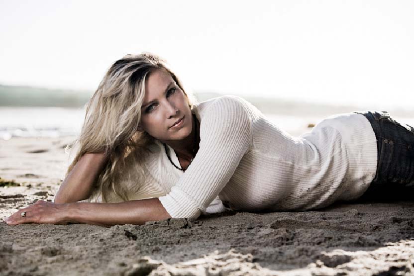
This image below is an example of natural lighting, the light connotes realism and a natural effect. The light really contrasts with the sand and the sea which add to the realism of the photo.

Back Lighting:
This is a prime example of back lighting as it connotes the complete opposite to natural lighting and creates surrealism. The lighting in this example is used to connote heroism and godliness, it makes the character look extremely important and brave.

Key lighting is used on characters and objects to create different effects. In this particular image it is used to create a light shadow across her face which connotes mystery as well as elegance and beauty.

Long Shot
A shot that shows a scene from a distance (but not as great a distance as the establishing shot). A long shot is used to stress the environment or setting of a scene. In filming your science-fiction movie, for example, you might use a long shot to show the monster causing traffic jams and panicked crowds.

Extreme Close UP
This is similar to the close up to an extreme scale, it is used to focus on small details of the face and connote the different emotions the subject creates or shows the significance of an object. For example, In a crime film this may be used to focus upon a small blood spatter and inform the audience.

High Angle Shot
This is a high angle shot, it makes the character look small and insignificant in a way or even less important. Its like the character is being looked down upon. For example, in an action film this could be used to show that the "baddie" is a "low life" or "scum" as he is looked down upon.

Low Angle Shot
This is a low angle shot, it connotes disorientation but also connotes a feeling of godliness or triumph and even power. For example, this could be used in a scene where the hero/heroine enters and looks powerful and godly. The lighting in this shot also adds to the effect which is used often in these types of angles.

Bird's Eye View
This bird's eye view is used to make the character feel small and insignificant just as the high angle does but to a more extreme degree. It also makes the character seem like prey to an eagle or bird, hence the name bird's eye view. For example, this could be used in a suspense thriller to show a character stalking another.

Medium Shot
This is a medium shot, it frames actors, normally from the waist up. The medium shot can be used to focus attention on an interaction between two actors, such as a struggle, debate, or embrace.

Worm's eye view
The worm's eye view is used to connote fear upon the audience and make the subject seem big and powerful. It is also used as a point of view from characters which are laying on the ground. For example, this could be used as a character walks over another character that has just been knocked onto the floor.

Canted Close Up
Not only does this shot tell the audience the characters emotions it also adds disorientation because of the canted angle which may mean a more enhanced emotions depending on the expression.

Close Up
This is another close-up but this one is slightly further out than the other which gives you a better view of the character's head. This could be used to establish what a character looks like close up and bring the audience closer to the character.

Canted Angle/Mid Shot
This is a mix between a mid shot and a Canted angle, this adds disorientation to the shot as well as the established character and his surroundings.

Canted Angle
This is a canted angle, it is used for a cinematic effect often used to portray the psychological uneasiness or tension in the subject being filmed. This is also a close up.

Subscribe to:
Posts (Atom)