
Tuesday 30 November 2010
Thriller Idea 2
This idea is a mix of our ideas from all of our first ideas.

Objects/Props:

Narrative:
A couple between their 50s and 60s are very political and follow the ideas of racism. The couple then discover there is a new resident in their neighbourhood and discover he is of another race. This couple then start following him, taking pictures of him and threatening him, telling him to return from where he came from or that he will die if he doesn't . At the end of the intro a member of the couple attack the victim from behind and he blacks out.
Plot:
A racist couple attack and kill various different people of different ethnicities, the police have no suspect because it is the least expected suspect who commits these murders.
Characters:
A man from African origins. 6ft 6 , strong built and long dark hair. Aged 28.
A Caucasian man, 5ft 11,average build, deteriating hair at a short length. Aged 58.
A Caucasian woman, 5ft 5, petite, long hair. Aged 55.
Possible film titles:
"Snap"
Target Audience:
16+ Anyone, it applies to women and men and is also aimed at the older generations not just the younger people.
Type of thriller:
Psychological Thriller
Crime:
Assault,racism and attempted murder.
Locations:
- Woodland pathway
- Streets

Objects/Props:
- Camera
- Metal Spade
- Bulldog/ Stafford Bull Terrier
- Photos
- Scissors
- Photo Frame
- Newspaper
- Radio

Narrative:
A couple between their 50s and 60s are very political and follow the ideas of racism. The couple then discover there is a new resident in their neighbourhood and discover he is of another race. This couple then start following him, taking pictures of him and threatening him, telling him to return from where he came from or that he will die if he doesn't . At the end of the intro a member of the couple attack the victim from behind and he blacks out.
Plot:
A racist couple attack and kill various different people of different ethnicities, the police have no suspect because it is the least expected suspect who commits these murders.
Characters:
A man from African origins. 6ft 6 , strong built and long dark hair. Aged 28.
A Caucasian man, 5ft 11,average build, deteriating hair at a short length. Aged 58.
A Caucasian woman, 5ft 5, petite, long hair. Aged 55.
Possible film titles:
"Snap"
Target Audience:
16+ Anyone, it applies to women and men and is also aimed at the older generations not just the younger people.
Type of thriller:
Psychological Thriller
Crime:
Assault,racism and attempted murder.
Wednesday 17 November 2010
Storyboard for Conversation (Preliminary task)
 First there is a close up of the character's hand opening the door. This is going to be a match on action shot, it will show the door being opened and then cut to him opening and walking out from the otherside.
 It then cuts to a shot of the character walking out of the room that the camera was previously in. This is a medium/long shot, it establishes the character and what he is doing. The character walks out of the toilet and then moves further foward into the room.
 This shot is the start of a shot/reverse/shot. The shot reverse shot starts off with a close up of Solay's face looking confused and looks as if he is thinking.

 This is a medium shot of what Solay is looking at, it is Josh searching and rummaging through his bag looking evil.
  This is another shot of Solay's reaction to Josh, it is the final piece to the shot/reverse/shot. The shot is a medium shot to catch the reaction as well as the surroundings.
  Solay then walks over to the table and sits opposite him, this shot is a long shot just capturing them both in the shot staring at eachother. At this point the 180 degree rule is established and from now on we could not cross the line.
 This is a POV shot of Solay from Josh's view. This gives the audience a view of what Josh is seeing. This is also an eyeline match because we saw josh looking at something and now we are seeing what he was seeing.
It then cuts to a Low angle shot of Josh getting angry at Solay.

The final shot is a high angle shot of Solay over Josh's shoulder.


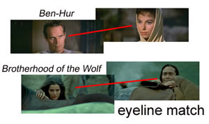
Eyeline Match
An eyeline match is a film editing technique. It is based on the premise that the audience will want to see what the character on-screen is seeing. The eyeline match begins with a character looking at something off-screen, there will then be a cut to the object or person at which he is looking. For example, a man is looking off-screen to his left, and then the film cuts to a television that he is watching.
Shot/Reverse/Shot
A shot/reverse/shot is a film technique which is used to someone's reaction to another person or item. For example, the first shot it looking at the woman, then the second shot is looking at the man and the third shot shows the woman's reaction/emotion. This technique is often used when something unexpected happens or the character sees something that they aren't meant to see.

Match On Action
Matching on action is where the camera cuts from one shot to another view that matches the first shot's action. By having a subject begin an action in one shot and carry it through to completion in the next, the editor creates a visual bridge which distracts the viewer from noticing the cut or noticing any slight continuity error between the two shots.
A variant of cutting on action is a cut in which the subject exits the frame in the first shot and then enters the frame in the subsequent shot. The entrance in the second shot must match the screen direction and motive rhythm of the exit in the first shot.
http://en.wikipedia.org/wiki/Cutting_on_action
180° Rule
The 180° rule is a basic guideline in film making that states that two characters in the same scene should always have the same left/right relationship to each other. If the camera passes over the imaginary line connecting the two subjects, it is called crossing the line. The new shot, from the opposite side, is known as a reverse angle.
In the example of a dialogue, if Owen (orange shirt in the diagram) is on the left and Bob (blue shirt) is on the right, then Owen should be facing right at all times, even when Bob is off the edge of the frame, and Bob should always be facing left. Shifting to the other side of the characters on a cut, so that Bob is now on the left side and Owen is on the right, will disorient the viewer, and break the flow of the scene.
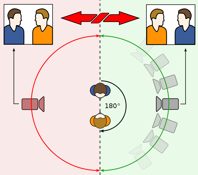
In the example of a dialogue, if Owen (orange shirt in the diagram) is on the left and Bob (blue shirt) is on the right, then Owen should be facing right at all times, even when Bob is off the edge of the frame, and Bob should always be facing left. Shifting to the other side of the characters on a cut, so that Bob is now on the left side and Owen is on the right, will disorient the viewer, and break the flow of the scene.

Tuesday 16 November 2010
Essay: What impact does ownership have on the media institutions in the industry you have studied?
In the film industry which we have studied, looking at Cinema city and Odeon I would say that there is a significant impact on what ownership does to the institution. Ownership can have strengths but it can also have disadvantages and I think t has more disadvantages than advantages.
The main advantage of ownership is that all of the cinemas in the chain get all of the newest films out that the institution are showing, being a chain they get all the promotions and technology that all of the other cinemas get as well. Being in chain they also keep high in the market and keep up the completion between other institutions. The other advantage is that the profits are spread across the chain and they do not have to manage their profits, in some points of view this would be a disadvantage. So I would say that ownership does have a big impact on the profits side of the institution as well as keeping everything up to date and keeping the competition high.
The biggest disadvantage of ownership is that the cinemas are all controlled by the head office, all of the schedules and films that are shown are all nationally chosen not by the individual cinema. This ties in with the ability to keep up in the market and have the latest films because the majority of films across these cinemas are high budget Hollywood films. 50% of the top twenty in 2009 were from the USA, owners are becoming too obsessed with the big budget films from the USA, and this is called Hollywoodisation. Owners in chain cinemas are more focused on the profit than what the viewers/customers views are.
Ownership can be a burden, there are some independent cinemas that escape the impact of ownership, they can then choose their own schedule, manage their own profits and organise however they want. These independent cinemas usually become part of a network, networks have less of an impact than ownership but they help out and don’t ask for anything in return. Cinemas can also become a part of Europa; Europa funds institutions to show European films, this comes as a great advantage. Being part of Europa means that the cinemas have to show 23% that are European and in exchange they get payments. If they show more European films hey get increased payments.
Looking at owned institutions and then looking at institutions that are part of a network. I think that the ownership has the biggest impact because it changes companies around and they all rally under one head office. Everything that is to be decided is sent to them. Sometimes it can make institutions better, sometimes it can destroy them. It isn’t necessarily the best impact though. Being a part of a network and being independent doesn’t have a huge impact like ownership but it does help out the institution more.
 So in conclusion I would say that ownership has a large impact but isn’t always in the institutions best interest and can ruin the business depending on the aims of the business.
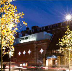
The main advantage of ownership is that all of the cinemas in the chain get all of the newest films out that the institution are showing, being a chain they get all the promotions and technology that all of the other cinemas get as well. Being in chain they also keep high in the market and keep up the completion between other institutions. The other advantage is that the profits are spread across the chain and they do not have to manage their profits, in some points of view this would be a disadvantage. So I would say that ownership does have a big impact on the profits side of the institution as well as keeping everything up to date and keeping the competition high.
The biggest disadvantage of ownership is that the cinemas are all controlled by the head office, all of the schedules and films that are shown are all nationally chosen not by the individual cinema. This ties in with the ability to keep up in the market and have the latest films because the majority of films across these cinemas are high budget Hollywood films. 50% of the top twenty in 2009 were from the USA, owners are becoming too obsessed with the big budget films from the USA, and this is called Hollywoodisation. Owners in chain cinemas are more focused on the profit than what the viewers/customers views are.
Ownership can be a burden, there are some independent cinemas that escape the impact of ownership, they can then choose their own schedule, manage their own profits and organise however they want. These independent cinemas usually become part of a network, networks have less of an impact than ownership but they help out and don’t ask for anything in return. Cinemas can also become a part of Europa; Europa funds institutions to show European films, this comes as a great advantage. Being part of Europa means that the cinemas have to show 23% that are European and in exchange they get payments. If they show more European films hey get increased payments.
Looking at owned institutions and then looking at institutions that are part of a network. I think that the ownership has the biggest impact because it changes companies around and they all rally under one head office. Everything that is to be decided is sent to them. Sometimes it can make institutions better, sometimes it can destroy them. It isn’t necessarily the best impact though. Being a part of a network and being independent doesn’t have a huge impact like ownership but it does help out the institution more.
So in conclusion I would say that ownership has a large impact but isn’t always in the institutions best interest and can ruin the business depending on the aims of the business.Friday 5 November 2010
My Final Adverts and Analysis/Evaluation


Analysis and Evaluation of Cosmetics Advertisement
Construction
In my advertisement i have used a medium shot of Catherine(Model), i wanted a shot that captured the details of her from her chest up but also capture the surroundings to show where she is and even establish what she is doing. I wanted her to the right in the photo so then behind her the light shone through the trees leading the eye towards her and the perfume bottle using the rule of thirds. The focus is mainly on Catherine but its not so focused that the background becomes blurry or fuzzy because i wanted the surroundings to be seen as well as her.
I have used natural lighting in my advert, the light shining through the trees onto Catherine and the forest connote natural beauty at it's finest. Untouched beauty if you will, which gives you a feel of hope. It also connotes an angelic feel, as if Catherine is mother nature or an angel.
The mise en scene is the forest, all i wanted was what looked like an untouched piece of woodland with a break of light through the trees and a large tree for Catherine to hide behind. The forest connotes a natural sense of beauty just as the light does, but it to a greater degree. The woodland connotes beauty and peace as well as a calm and gentle feel. It makes the target audience feel calm yet excited about the perfume because it natural beauty and is telling them that there is no need to be fake, just be natural.
I didn't crop my image because i took it just how i wanted it to be.
The name of the perfume is Hush and the tag line is 'Smell as gorgeous,gracious and delicious as fresh forest air'. The name of the advertisement connotes quietness and calmness, it adds to the connotations of nature because it says that you should be quiet and smell the freshness of nature and its beauty. The tag line adds to the meanings into the advertisement by basically saying what this perfume will make you as gorgeous as a lush woodland.
The narrative of the advertisement originally was that she was being chased by men because she smelt so good,but i changed it because i thought the idea of her wanting everything to be quiet so she can listen,smell and see the magneficence of the woodland seemed more realistic and beliveable, it also seemed relateable because a lot of people like to take a walk in the woods to see it's beauty. I consructed this from seeing the lynx advert where everyone follows the man who has lynx deoderant on. I then wanted a similar advert but in a woods where she could play hide and seek with them. But then i had the idea of her wanting everything to be calm and quiet so she can relax.
I wanted Catherine to be in casual wear, nothing too fancy because i wanted her to look natural, like she would when she goes somewhere on your average day. But i wanted her to have flowers in her hair to connote nature and beauty but i also wanted her to look like she could be mother nature, just your average girl looking normal but then the woodland brings the beauty out in her. Her hair needed to be down to look natural and flowing. Her pose was important because i wanted her to lean against the tree and look relaxed, the use of the finger over her lips refers to the perfume title. In the black and white advert i coloured Catherine's lips a bright red, i wanted to do this so then the audience could spot her lips which would then lead them onto looking at the advert.
My advertisement represents young woman who want to look after the world and keep everything the way it is, natural.
Technologies
I used a 10 mega pixel camera that gave me a clean crisp image, it also had a variety of settings that i could use to my advantage. After the photo was take i used Photoshop Elements 7 to change anything that i wanted to the image. Both of these helped me change the lighting to the way i wanted and the focus of the image as well.
The availability of new technologies change our perception of media texts because they cause us to take them for granted, a few years ago an advert similar to mine would be an amazement but anyone can make anything they want in this day and age. Technology is used by everyine and without it the world would go into chaos.
Target Audience
Refer to target audience post.
Thursday 4 November 2010
Cosmetics Advert: Target Audience
 My target audience are women aged 16-25 mainly because it relates to them more because of the woman in the advert. But it could appeal to a woman of any age in theory. I think my advert will appeal to younger women more because they can associate themselves to the model, the style if the advert is also very feminine and links to the nature side of women.
 A- Higher managerial, administrative,or professional Upper Middle Class.
B- Intermediate managerial, administrative or professional Middle Class.
C1- Supervisory or clerical and junior managerial, administrative or professional Lower Middle Class.
C2- Skilled manual workers Skilled Working Class.
D- Semi and unskilled manual workers Workering Class.
E- Those at the lowest levels of subsistance- Entirely dependant on state for long-term income.
 Audience personal ambitions: I think that the target audience of my advert is going to be reformers because they are eco-friendly and the idea of nature and forests may convince them to but my product. I think it will also apply to individuals because it is a different style perfume and is different to the mainstream aimed products.
Wednesday 3 November 2010
Choosing My Font

These are a range of fonts that would suit my advert. My advert is going to be aimed at women. I thought that a curly natural flowing font would be needed to go along with the theme of nature and tie in with the likes of women. Most of these fonts are very feminine because they look hand written and are very curly. A lot of these fonts are serif as well, this is seen as more feminine.
In my example adverts, several of the ones aimed at women use these types of fonts.
My favorite 5 are Monotype corsiva, Freestyle script, French script, Mistral and Vivaldi. They are all very flowing apart from Monotype corsiva but Monotype corsiva is similar to the fonts that a few other examples of mine have used, whick i like.
Vivaldi- The vivaldi font is eye catching, it is sharp but runs smoothly. It is a feminine font and would fit well for the adverts main title but not for the writing. As soon as i saw this font it reminded my of perfume adverts.
Mistral- Mistral is a smooth, courvy font which flows well as well but it can be difficult to read, this could only be used for the title. This font is a little more masculine than the Vivaldi one, this could affect the look of the advert.
Monotype Corsiva- This font is a plainer than the rest but it still has a femenine effect with the serifs, this would be best used foe the text not the title as it isnt as visually interesting.
Freestyle Script- This font is smooth and is basically very neat italic handwriting, i like this because its quite feminine to relate to the audience as well as it being swirly to link to nature and growth. I could use this for either the title or the text.
French Script- This font is very formal like written in a letter by hand, it reminds me of old fashioned scribbly letters. I like this font because of this and its old just like a forest, it links to women because it is again feminine. This could be used for either the text or the title.
I will choose when i put together my advertisment and judge which is the best one.
Choosing a photo for my advert
 These photos are all of the photos that i have taken for the main image in my advert. This was based on one of my origninal ideas of having the woman hiding behind a tree and men searching for her because of the smell of the perfume. Now the idea is to have the perfume connoting ideas of nature as well as a sexy look. I want to connote that nature is good, nature is beautiful.I have tried a few different shots of my model catherine, she has also pulled off a few different poses so i had a range of images to choose from and pick the best.


Tuesday 2 November 2010
Thriller Location Ideas.


Subscribe to:
Posts (Atom)